CSS (Cascading Style Sheets) controls how web pages look and feel colors, spacing, layout, and typography. In this lecture we’ll learn the three ways to add CSS, how selectors work, how to style with colors and fonts, how the box model controls spacing, and how to use responsive units for layouts that adapt to any screen.
Ways to Add CSS: Inline, Internal, External
Inline CSS
Applied directly on an element with the style attribute.
Use rarely (quick tests/small overrides).
<h1 style="color:#2f855a; margin:0;">Hello</h1>Internal CSS
Placed inside <style> in the HTML <head>.
Good for small pages/demos.
<head>
  <style>
    h1 { color:#2f855a; }
    p  { line-height:1.6; }
  </style>
</head>
External CSS (Best Practice)
Linked stylesheet; reusable and cacheable.
<link rel="stylesheet" href="styles.css">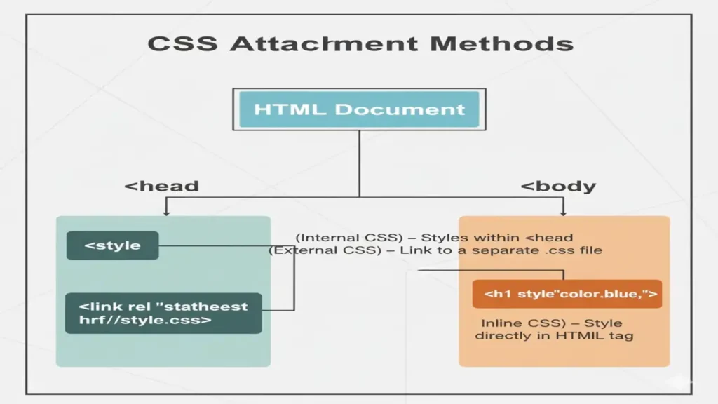
You can create a best design using html and make it more engaging using css, so here is a lecture about Html Fundamentals must to see.
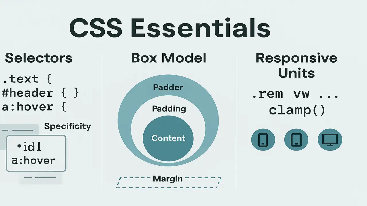
Selectors: Targeting Elements
Core Types
- Element:
p {} - Class:
.card {}(many elements) - ID:
#hero {}(unique element) - Attribute:
input[type="email"] {} - Descendant:
nav a {} - Child:
ul > li {} - Pseudo-class:
a:hover {} - Pseudo-element:
p::first-line {}
/* examples */
.card.highlight { border:2px solid #4ec7a0; }
#hero h1 { font-size:2.25rem; }
button:disabled { opacity:.5; cursor:not-allowed; }
Specificity (lowest → highest): element < class/attribute/pseudo-class < ID < inline
Tip: avoid overusing IDs for styling; prefer classes.
Colors, Fonts & Basic Typography
Colors
- Hex:
#2f855a - RGB:
rgb(47,133,90) - HSL (great for design systems):
hsl(150 47% 35%) - Opacity with alpha:
rgba(47,133,90,.8)orhsl(150 47% 35% / .8)
Fonts
- Web-safe + Google Fonts
- Font stack fallback
:root {
  --brand: hsl(160 55% 45%);
}
body {
  color:#1f2937;
  font-family: "Inter", system-ui, -apple-system, Segoe UI, Roboto, Arial, sans-serif;
}
h1 { color: var(--brand); letter-spacing:.2px; }
The CSS Box Model
Every element is a box:content → padding → border → margin
.card {
  width: 300px;
  padding: 16px;
  border: 2px solid #e2e8f0;
  margin: 12px;
  box-sizing: border-box; /* includes padding/border in width */
}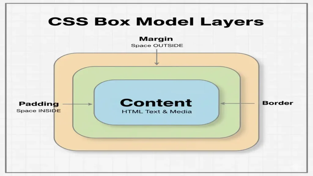
Key Tip: Use * { box-sizing: border-box; } globally for predictable sizing.
Responsive Units & Layouts
Units You’ll Use
- Absolute:
px - Relative to font size:
em,remrem= root font size; great for consistent scale
- Relative to viewport:
vw,vh,vmin,vmax - Fluid clamp():
clamp(min, preferred, max)
html { font-size: 16px; }           /* 1rem = 16px */
h1 { font-size: clamp(1.75rem, 3vw, 3rem); }
.container { max-width: min(90vw, 72rem); margin-inline:auto; }
.section { padding: clamp(1rem, 2vw, 2rem); }
Simple Responsive Layout (no framework)
.grid {
  display: grid;
  gap: 1rem;
  grid-template-columns: repeat(12, 1fr);
}
.card { grid-column: span 4; }
@media (max-width: 900px) { .card { grid-column: span 6; } }
@media (max-width: 600px) { .card { grid-column: span 12; } }
HTML
<section class="grid">
<article class="card">A</article>
<article class="card">B</article>
<article class="card">C</article>
</section>Mini Practice: Profile Card & Responsive Grid
A) Profile Card (Box Model + Typography)
HTML
<div class="profile">
  <img src="avatar.jpg" alt="Student" />
  <h2>Student Name</h2>
  <p>Frontend Learner</p>
  <button>Follow</button>
</div>
CSS
.profile{
width:min(90vw, 340px);
padding:1rem;
border:1px solid #e5e7eb;
border-radius:12px;
box-shadow:0 6px 18px rgba(0,0,0,.06);
text-align:center;
}
.profile img{
width:96px; aspect-ratio:1/1; border-radius:50%; object-fit:cover;
margin-bottom:.75rem;
}
.profile button{
background:#2f855a; color:#fff; border:0; padding:.6rem 1rem; border-radius:8px;
}B) Responsive Product Grid (Units + Media Queries)
CSS
.products{
  display:grid; gap:1rem;
  grid-template-columns: repeat(auto-fit, minmax(220px, 1fr));
  padding: clamp(1rem, 3vw, 2rem);
}
.products .item{
  border:1px solid #e5e7eb; padding:1rem; border-radius:10px;
}
HTML
<section class="products">
<div class="item">Item 1</div>
<div class="item">Item 2</div>
<div class="item">Item 3</div>
</section>Summary
- Choose the right CSS attachment method (prefer external).
- Use classes and understand specificity.
- Apply color systems and accessible typography.
- Think in the box model; enable
border-box. - Build responsive designs with
rem,vw/vh,clamp(), Grid/Flex, and media queries.
People also ask:
CSS (Cascading Style Sheets) is used to style and format HTML elements, controlling layout, colors, fonts, spacing, and overall presentation of web pages.
There are three types of CSS: inline CSS (applied directly within HTML tags), internal CSS (written inside a <style> tag in the HTML file), and external CSS (linked through a separate .css file).
External CSS keeps design separate from content, allows consistent styling across multiple pages, and makes websites easier to maintain and update.