Modern web pages must adapt perfectly across phones, tablets, and desktops.
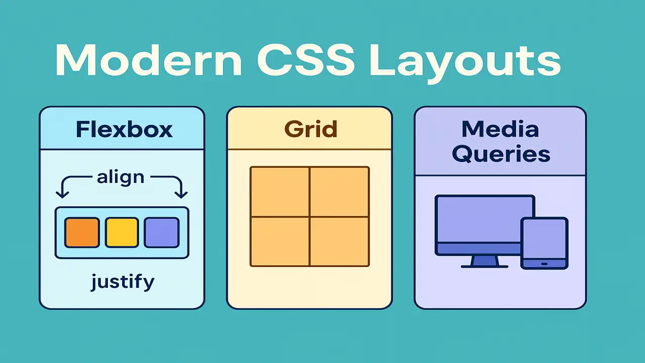
Traditional layout techniques (like floats or tables) are outdated Flexbox and CSS Grid are now the standards.
In this lecture, you’ll learn how to:
- Build flexible and aligned layouts using Flexbox
- Design full-page grids with CSS Grid
- Make designs responsive using Media Queries
- Combine all techniques into a responsive landing page
Understanding Flexbox
What is Flexbox?
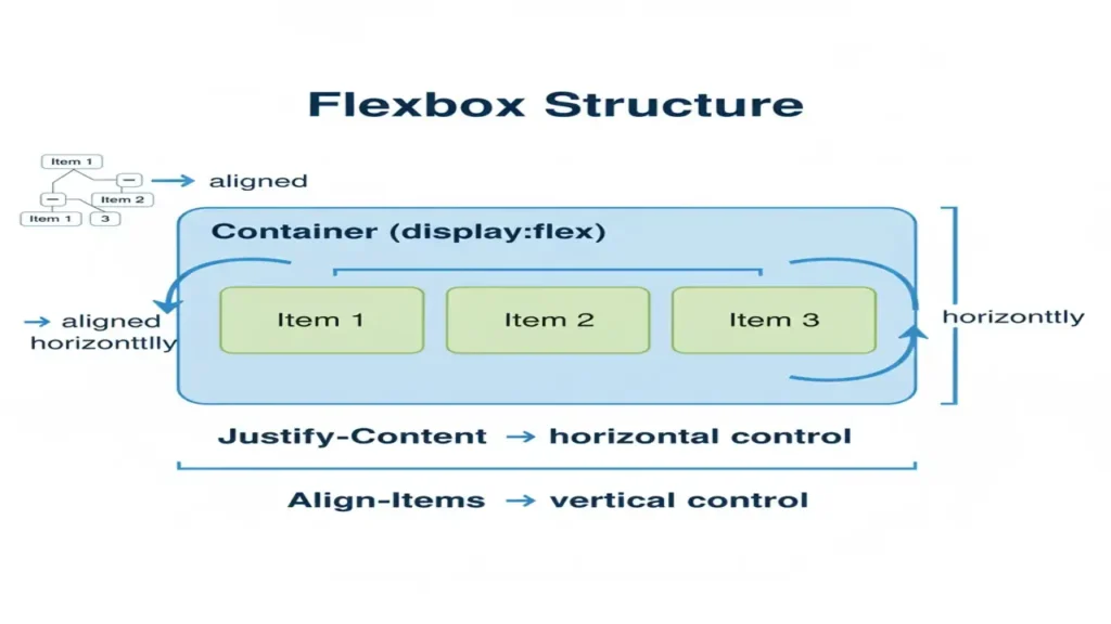
Flexbox (Flexible Box Layout) helps align items in a row or column efficiently, even when their size is unknown.
Core Concepts
display: flex— activates flex containerjustify-content— controls horizontal alignmentalign-items— controls vertical alignmentflex-wrap— allows wrapping itemsflex-direction— row / column layout
Example: Centering Boxes
<div class="container">
  <div class="box">1</div>
  <div class="box">2</div>
  <div class="box">3</div>
</div>
.container {
display: flex;
justify-content: center;
align-items: center;
gap: 10px;
height: 200px;
background: #f0f0f0;
}
.box {
background: #4ec7a0;
color: white;
padding: 20px;
border-radius: 8px;
}
Wanna explore some CSS essentials? You are at right place, please read it thoroughly.
Understanding CSS Grid System
What is CSS Grid?
CSS Grid is a two-dimensional layout system that allows you to control rows and columns simultaneously.
Key Properties
display: grid— turns element into a grid containergrid-template-columns/grid-template-rows— define structuregap— space between cellsgrid-column/grid-row— control item span
Example: Two Column Layout
<div class="grid">
  <div class="item">Header</div>
  <div class="item">Sidebar</div>
  <div class="item">Content</div>
  <div class="item">Footer</div>
</div>
.grid {
display: grid;
grid-template-columns: 1fr 3fr;
grid-template-rows: auto 1fr auto;
gap: 10px;
}
.item {
background: #ffc561;
padding: 15px;
border-radius: 5px;
}Making Designs Responsive with Media Queries
What are Media Queries?
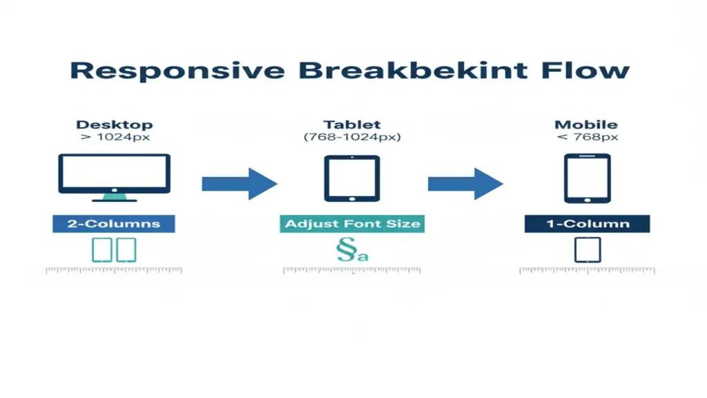
Media queries let your page detect screen size and apply different CSS rules ensuring the design fits any device.
Example: Responsive Text and Layout
body {
  font-size: 18px;
}
@media (max-width: 768px) {
  body {
    font-size: 14px;
  }
  .grid {
    grid-template-columns: 1fr;
  }
}
On large screens two-column layout
On mobile single-column stacked layout
Building a Simple Responsive Landing Page
Goal
Combine Flexbox, Grid, and Media Queries into a real-world responsive project.
Example Structure
<header>My Website</header>
<section class="intro">
  <h1>Welcome to Web Design Framework</h1>
  <p>Learn to build modern responsive websites easily.</p>
  <button>Get Started</button>
</section>
<section class="features">
  <div class="feature">Fast</div>
  <div class="feature">Responsive</div>
  <div class="feature">Beautiful</div>
</section>
<footer>© 2025 ElecturesAI</footer>
header, footer {
text-align: center;
background: #2f855a;
color: white;
padding: 15px;
}
.intro {
text-align: center;
padding: 50px;
}
.features {
display: flex;
justify-content: space-around;
flex-wrap: wrap;
}
.feature {
background: #4ec7a0;
color: white;
padding: 20px;
margin: 10px;
border-radius: 10px;
flex: 1 1 200px;
}
@media (max-width: 768px) {
.features { flex-direction: column; }
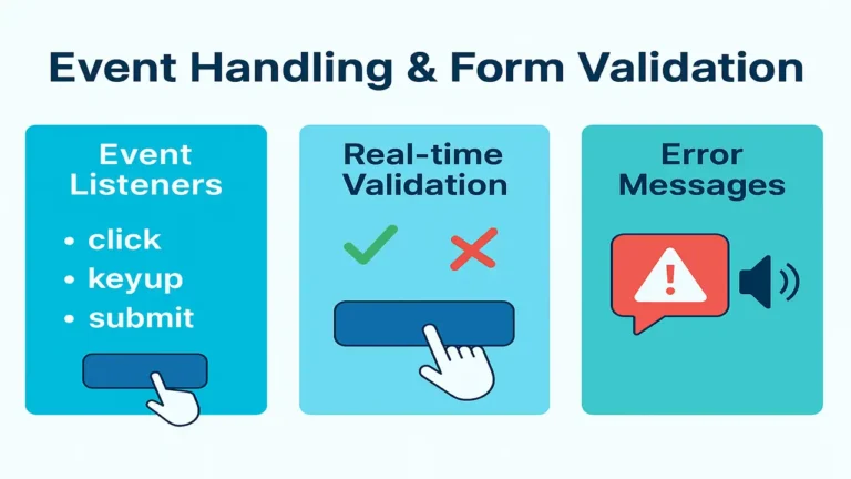
}You may interested in UI components and event handling.
Conclusion
Modern CSS layouts empower developers to design fluid, responsive interfaces quickly.
Flexbox handles one-dimensional alignment, Grid structures complex layouts, and Media Queries ensure adaptability.
By combining them, you can create professional, mobile-first websites easily.
People also ask:
Modern CSS layouts use technologies like Flexbox and Grid to create responsive, flexible, and complex web designs without relying on floats or tables.
Flexbox is ideal for one-dimensional layouts (rows or columns), while Grid handles two-dimensional layouts with precise control over rows and columns.
They simplify responsive design, improve accessibility, and allow developers to build cleaner, scalable, and visually consistent web pages.